ViewTube

ViewTube
Sign inSign upSubscriptions
Filters

Upload date

Type

Duration

Sort by

Features

Reset

249 results

Code with Rizwan
I Gave AI My Excel File… It Built a Complete Sales Dashboard!

Can AI turn a simple Excel file into a professional, interactive sales dashboard? In this video, I put AI to the test and build a ...

6:42
I Gave AI My Excel File… It Built a Complete Sales Dashboard!

15 views

6d ago

Centre of Best Learnings (CBL)
Create an interactive excel dashboard to track and visualise progress dynamically | full tutorial

Create an interactive excel dashboard to track and visualise progress dynamically (full tutorial) #exceldashboard ...

11:28
Create an interactive excel dashboard to track and visualise progress dynamically | full tutorial

105 views

4d ago

Frozzenrainbow
Create an Interactive Dashboard in Excel | Laboratory & Research Data Analysis | Episode 17

Create an Interactive Laboratory Dashboard in Microsoft Excel 365! Welcome to Episode 17 of the Frozzenrainbow Advanced ...

6:33
Create an Interactive Dashboard in Excel | Laboratory & Research Data Analysis | Episode 17

21 views

4d ago

bi-champ
What if AI built Excel apps and maps, not just charts?

Turn an Excel table into apps and maps, not just charts, and change them in plain English. Full walkthrough, the three datasets to ...

6:57
What if AI built Excel apps and maps, not just charts?

3,984 views

3d ago

Frozzenrainbow
Data Visualisation in Excel | Bar Charts, Pie Charts, Histograms & Box Plots | Episode 16

Welcome to Episode 16 of the Frozzenrainbow Excel Tutorial Series! We are now entering the next phase of our Excel learning ...

6:23
Data Visualisation in Excel | Bar Charts, Pie Charts, Histograms & Box Plots | Episode 16

64 views

5d ago

Esther Chinenye Anagu
Stop Learning Excel, SQL, and Power BI Without Doing This!

Planning to become a data analyst in 2027? You need to hear this. The industry is changing, especially with AI. And simply ...

17:51
Stop Learning Excel, SQL, and Power BI Without Doing This!

1,286 views

5d ago

HildaFonse Microsoft & Statistics
Introduction To Excel Charts HM&S 90

Welcome to the Introduction to Charts in Microsoft Excel tutorial HM&S 90 In this video, we begin our journey into data ...

13:22
Introduction To Excel Charts HM&S 90

69 views

4d ago

ThinkData Solutions, Inc
Why Use Power BI When You Already Have Excel? | Power BI Explained

If you already know how to build PivotTables, charts, and slicers in Excel, you may understand more about Power BI than you ...

4:08
Why Use Power BI When You Already Have Excel? | Power BI Explained

35 views

2d ago

DrHayati
Spreadsheet: Using Excel

TOPIC 6: SPREADSHEET – USING EXCEL | Mastering Data Organisation, Analysis & Visualisation** **Welcome to Topic 6: ...

8:20
Spreadsheet: Using Excel

3 views

4d ago

Office Monk
3 Minutes Dashboard in Excel with Claude AI No Prompt Needed!

Download the practice file / dashboard: https://tinyurl.com/mvh4ssn6 (Excel Data) https://tinyurl.com/3xc674dc (Prompt) ...

4:49
3 Minutes Dashboard in Excel with Claude AI No Prompt Needed!

97 views

12h ago

SKILL MADE EASY
Excel vs SQL vs Python vs Power BI vs Tableau | When to Use Which Tool For Data Analysis?

Excel vs SQL vs Python vs Power BI vs Tableau | When to Use Which Tool For Data Analysis? Why do Data Analysts need so many ...

12:21
Excel vs SQL vs Python vs Power BI vs Tableau | When to Use Which Tool For Data Analysis?

154 views

6d ago

Master of Mylab
Excel Chapter 3 Simulation Training | Excel Simulation Training |excel chapter 3 simulation training

... #Spreadsheet #DataAnalysis #BusinessIntelligence #Productivity #TechSkills #ExcelSkills #DataVisualization #ExcelFormulas ...

14:55
Excel Chapter 3 Simulation Training | Excel Simulation Training |excel chapter 3 simulation training

6 views

12h ago

Practical Tool Lab
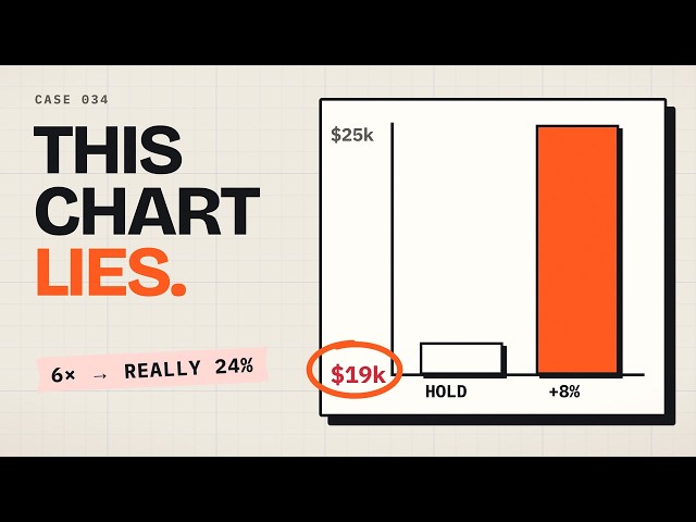
Misleading Charts: The Axis Trick That Exaggerates Results

Marisol's chart for the team makes an 8% price raise look like almost six times the profit. The real numbers: $20000 a month today ...

4:15
Misleading Charts: The Axis Trick That Exaggerates Results

0 views

5d ago

ThinkData Solutions, Inc
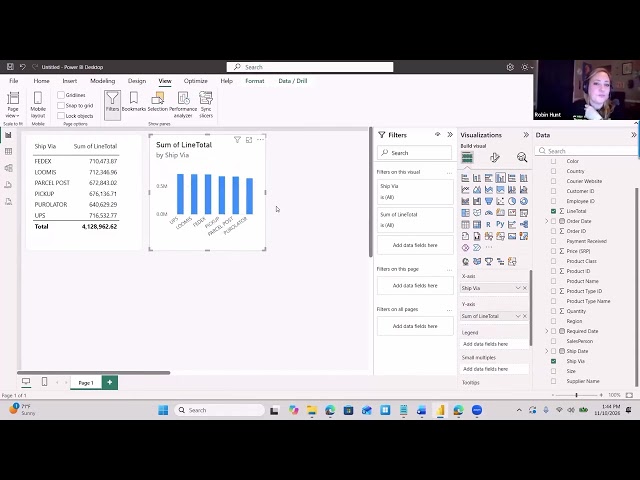
Power BI for Beginners: Build Your First Visualizations | Part 2

Not sure which visualization to use in Power BI? You're not alone! In this lesson, Robin Hunt demonstrates how to start with the ...

9:29
Power BI for Beginners: Build Your First Visualizations | Part 2

7 views

7h ago

Big Ideas with Dr Zemin Chen
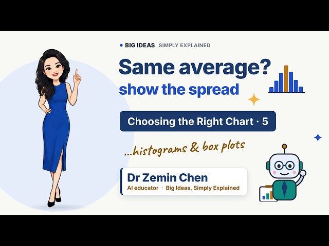
Histograms and Box Plots: Show the Spread, Not Just the Average | Choosing the Right Chart Ep 5

Two branches sell the same number of coffees a day, on average. But one is calm, and the other is chaos. In this episode of ...

4:13
Histograms and Box Plots: Show the Spread, Not Just the Average | Choosing the Right Chart Ep 5

2 views

4d ago

Elena Kell
Claude's New Features Can Do THAT? (I Tested Them on My Business)

Grab my free guide with use cases and starter prompts → https://claude-sheets-whiteboards-data.vercel.app Join the Solo ...

14:29
Claude's New Features Can Do THAT? (I Tested Them on My Business)

239 views

6d ago

InfoZoom
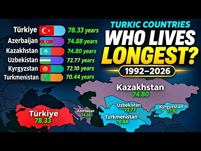
Which Turkic Country Lives the Longest? | 1992–2026

... both sexes combined #LifeExpectancy #TurkicCountries #Longevity #BarChartRace #DataVisualization #CountryComparison ...

8:06
Which Turkic Country Lives the Longest? | 1992–2026

2,145 views

9h ago

HEALTHCARE TIPS N TRICK BY PAYAAM VOHRA MEDICO
DAY 6 | TABLEAU TUTORIAL 🔥 | DATA VISUALIZATION & DASHBOARD CREATION | 100% PRACTICAL TRAINING

DM 8356077360 CONNECT WITH ME ACROSS ALL PLATFORMS: Official Learning Portal: ...

15:44
DAY 6 | TABLEAU TUTORIAL 🔥 | DATA VISUALIZATION & DASHBOARD CREATION | 100% PRACTICAL TRAINING

100 views

Streamed 4d ago

The Data Classroom
Data Visualization for Beginners | Choosing the Right Chart | FDS Unit 3 Topic 5

The question you are asking decides the chart you should draw. Bar, line, pie, histogram, scatter and box plots explained with ...

8:24
Data Visualization for Beginners | Choosing the Right Chart | FDS Unit 3 Topic 5

8 views

2d ago

Big Ideas with Dr Zemin Chen
Pie Charts: When They Work and What to Use Instead | Choosing the Right Chart Ep 4

Pie charts are the most criticised chart in the world. But they're not always wrong. In this episode of Choosing the Right Chart, ...

4:02
Pie Charts: When They Work and What to Use Instead | Choosing the Right Chart Ep 4

2 views

4d ago